pain chaud
The client
the mission
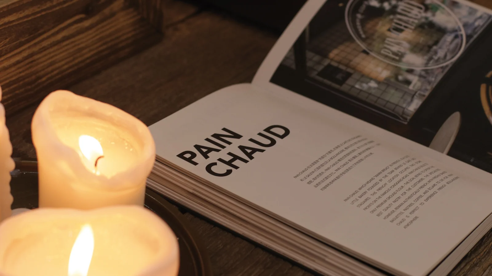
Pain Chaud ("Hot Bread") is a well known Shanghai-based Coffee & Bakery institution under the famous Café des Stagiaires food group. After nearly 5 years, and several locations within the city, Pain Chaud set itself up as a leader in Shanghai when it comes to excellent bakery quality and unique coffee experiences.
In the beginning, Pain Chaud started quite shier, with a more classic in-shop experience paired with a quieter and less emotionally engaging name, La Boulangerie ("The Bakery"). With the booming of the'baguette industry in Shanghai, Pain Chaud quickly realised there was a leadership position to take if they wanted to survive the buzzing city. With a considerable amount of competitors, the French bakery decided to move to something more classy, authentic and memorable, developing a new gourmet menu, unique interior design experience anda brand new name. From "La Boulangerie," Pain Chaud was born. Token of tradition and articulating flavors from an an ideology of smell, the bakery contacted me to develop the new brand signature which would translate the new codes and values, visually seducing and emotionally engaging customers, from there on.
Challenges and objectives

*Pain Chaud La Boulangerie's previous logotype
The main challenge was to sort something unique out of a very busy and booming industry, where everyone would try to use the same visual codes to illustrate their products locally (ie: wheat), but eventually internationally (we do not want to count the number of French bakeries worldwide, do we?).
The opportunity we had with Pain Chaud relied on the name itself, not as a brand name, but as a product descriptor. And it certainly would not have been smart to double up the product description by visually illustrating ingredients, as most people do. Instead, I decided to focus on what makes the name unique – the story underneath. Being French myself, I could already picture the hot bread in the making – watching the baker making the bread, seeing the loaf of bread in the oven slowly rising, the golden crust... and of course, the smell. Ah, yes, the smell of a hot, freshly baked bread.
Our opportunity to visually stand out was not about wheat (although ingredients are important... when it comes to food, quality speaks for itself. Otherwise, you end up like their infamous competitor, Farine). It was about knowledge and craftsmanship, and how can we make a sensorial experience emanate from this brand new visual signature. So here, I designed an iconic macaron shape, quality stamp like, conveying all the values our new born bakery brand would need to conquer the market and seduce bakery and coffee lovers.
If you travel to Shanghai, be sure you stop by Pain Chaud and give it a try – supreme coffee and exquisite croissant! Meanwhile, you can still have a look at this video.